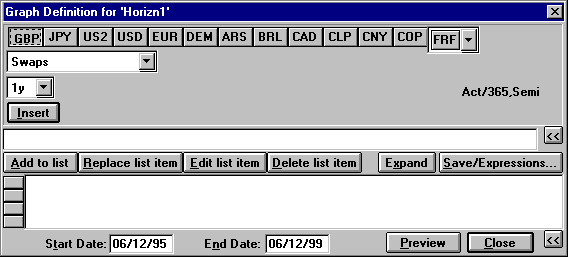
Creating a Graph in Horizon
All graphs are created using the Graph Definition Dialogue (GDD) box, which is permanently attached to a graph for future reference and amendment. The GDD is divided into three sections. The upper section is used to select a curve, the middle section is where a curve is edited, and the lower section holds the curves to be displayed and the time period covered by the graph.
The upper section assists the user by dynamically displaying options, in the form of drop-down menus, depending on selections made from each previous menu.
The middle section is the Edit Box. Curves are built here when using the special functions of Horizon.
The lower section holds the finalised curves and information on the axis to be used together with the date range of the display.
Back to top of page
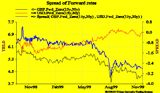
Spread of Forward Rates
This graph represents the spread between the USD and the GBP 15 year swap in 15 years time. The rate is displayed on the left hand axis and the spread on the right hand axis.
Back to top of page
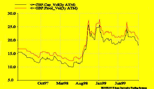
Implied Volatility
Caps and Floors at the money
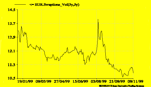
Swaptions
This graph represents the volatility at the money of a 5 year option on a 5 year swap.
Back to top of page
Analysing
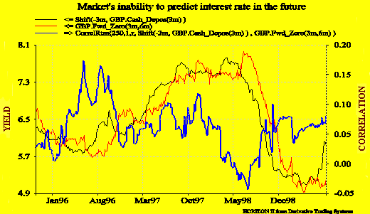
Market Predictions of Interest Rates
The Shift
function displaces results earlier or later along the
time axis, enabling comparison of events where some form
of time-lag effect is postulated. Correlation is a
measure of how well the best relationship of a specified
kind fits a set of data.
In this
example we show an example of the inability of the market
to predict interest rates in the future. We have plotted
the correlation of the DEM 3m/6m forward series with the
three months cash series shifted back three months. We
have used the correlation as a measure of the success (or
lack of success) of the market to predict cash rates from
the forward curve.
Back to top of page
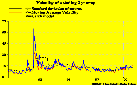
Volatility Analysis
The graph
below represents the volatility of a Sterling two year
swap during the exit of Sterling from the ERM system
(1992), using three different methods available within
HorizonII. While the annualised standard deviation of
returns is the method most commonly used by many
practitioners, it has the problem that it generates a
sustained high volatility figure for the entire sampling
period being used if there is a large movement in the
underlying rates, as can be clearly seen in the graph.
In practice,
implied volatility will tend to revert to a previously
established mean or to a slightly different level if
fundamentals of the product have changed significantly.
For this
reason, we have implemented the GARCH and Moving Average
methods. The GARCH model has been chosen as it is one of
the models becoming increasingly used by practitioners
and one that benefits from the concept of mean reversion.
One of the pitfalls with this model is evident when
events like the Sterling ERM exit occurs. The volatility
calculated by the GARCH model on this date is extremely
high and from comparisons done with implied volatilities
is disproportionate to market implied volatilities.
In order to
compensate for this weakness in the GARCH model we have
implemented a redesign of GARCH which we have called the
Moving Average Model. This behaves in very much the same
fashion as the GARCH model except in times of extreme
volatility when it tends to not overstate the numbers in
the same way as the GARCH.
The
parameters chosen for each of these models were designed
to give a high degree of correlation with futures options
implied volatilities.
Back to top of page
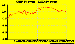
Adjustment
of Swap Rate Compounding
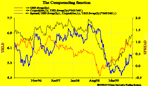
In this
example, we are looking at the spread between a sterling 2
years swap (Act/365, semi annualised coupon) and a USD 2
year swap (Act/360, annualised coupon). Using the
compounding function and the edit box we manipulate the
basis of the USD swap by changing the frequency from 1
year to 6 month and adjusting the number of days per year
to get an accurate spread.
Back to top of page
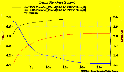
Term
Structure Spreads
This graph
represents the 30 yr EUR Term structure plotted with the 30 yr USD Term Structure and the spread between
these two curves on 9th November 1999.
Back to top of page
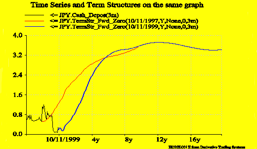
Combining Term Structures with Time Series
Horizon II
enables you to plot a time series and term structure on
the same graph. It is possible to compare the expectation
of the market in the past with the reality of it. The graph shows the 3 month forward curve on various dates plotted at various times on the 3 month deposit rate.
Back to top of page
|

 ... the Highly Acclaimed Graphics Tool (Free on-line Trial...)