|
|
Formatting TextIf you use a word processor, you'll be used to selecting a font to complement the style of your document and its content. Perhaps you also vary the size of the font, and use bold and italic formats. It's possible to do the same in your web documents. You can also vary the colour of the font, rather than having the same colour throughout the document. Beware of using too many colours or font styles though, as it can be irritating and distracting to be faced with a screen full of different colours and a variety of font styles in many different sizes! Be selective. Simple formattingWe have already used EM and STRONG to indicate that certain words or phrases should be emphasised. Sometimes though, you simply want to highlight a word or phrase visually without affecting the way in which it would be read out loud.
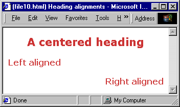
Text alignmentTo align a specific block element, for example a heading or a paragraph, add the ALIGN attribute to the opening tag for that element. This attribute can have the values LEFT, CENTER (note the American spelling again), RIGHT or JUSTIFY. So to centre a level 1 heading, you could use: <h1 align="center">This is a centred heading</h1>
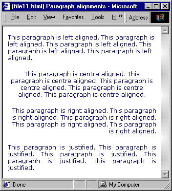
Figure 12: Heading alignments Similarly, if you wanted to justify the text in a paragraph, you could use: <p align="justify">Paragraph text here</p>
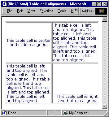
Figure 13: Paragraph alignments Text contained within table data elements can be aligned both vertically and horizontally. Vertical alignment within the table cell is defined by the valign attribute, which can have the values TOP, MIDDLE and BOTTOM. Horizontal alignment within the table cell is defined by the align attribute, which can have the values LEFT, CENTER and RIGHT. So if you wanted the text in a specific table cell to sit in the middle of cell, you would use: <td align="center" valign="middle">Text here</td>
Figure 14: Table cell alignments FontsTo specify a font style, colour or size, you need to use the FONT element. This is an "in-line" element, which means it can be nested inside block elements like headings, paragraphs and list items. It is incorrect to enclose a heading or paragraph within a set of FONT tags, which means that you may have to include a set of FONT tags within every heading and paragraph in your document. Font faceTo specify which font should be used, you use the FACE attribute. So to specify that a paragraph should be displayed using the Arial font, you would use: <p><font face="Arial">Paragraph text here</font></p>
What happens if a user doesn't have that font installed on their machine? Their browser will use whatever font they have specified as the default font. So you might want to suggest alternative fonts, in case your first choice of font isn't available to the user. You can do so like this: <p><font face="Arial, Helvetica, sans-serif">Paragraph text here</font></p>
In this case, the text will be displayed using the Arial font if it's installed on the user's machine. If that font isn't present, but the Helvetica font is, it will be used instead. If neither of these fonts is installed, the browser will use an alternative font that fits the definition "sans-serif" - this is known as a "font family", ie it doesn't specify a single font, it specifies a type of font. Other font families you can use are "serif" (for example "Times New Roman" on PCs or "Times" on Macs) and "monospace" (for example "Courier New" on PCs or "Courier" on Macs). It is usually a good idea to suggest several alternative fonts and a "last resort" font family. Font colourThe FONT element has a COLOR attribute which lets you specify the colour of a section of text. The colours are defined using the RGB hexadecimal values as described in the earlier "Adding Colour" section of this tutorial. To suggest that a specific heading is displayed using the Garamond font in red (and suggest that Times New Roman or another serif font be used if Garamond is not available to the user), you would use: <h1><font face="Garamond, Times New Roman, serif" color="#FF0000">Heading text here</font></h1>
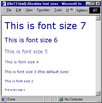
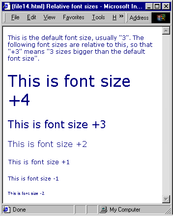
Font sizeFont sizes are scaled from 1 to 7. The usual default or "standard" size is 3. You can specify the font size in two ways: absolute or relative. Absolute size<font size="2">Text here</font>
or any other absolute size from "1" to "7". Figure 15: Absolute font sizes Relative size<font size="-1">Text here</font>
or any other relative size which results in an absolute size from 1 to 7. The example given above suggests that the browser displays the text one size smaller than the user's current default text size. When you are working with font sizes, you need to bear in mind that the actual, physical size of the characters depends on things over which you have no control - the size of the user's monitor screen, the resolution it is set to and what text size setting they are using in their browser. In general, the use of relative sizes is preferable to using absolute sizes, since it takes into account the user's preferences. Figure 16: Relative font sizes |
|
|
|